Posted on 9/29/2015 in UX and Design
In part one of this series, I covered the first of four phases that go into building and delivering a successful website. Now that we have gathered our requirements and planned for success, it’s time to begin phase 2: Design
During the discovery and boarding phase, you should have uncovered the following pieces of important information:
- Who is my target audience?
- What are they looking for on my site (information, making a purchase, etc)?
- What do you consider a successful conversion on the site?
The answers to these questions, along with the output of the functional specification document that you started during the boarding phase, will act as the launching board for your design.
Establishing Look and Feel
The best way to start the design process is to create 2 unique homepage design layouts based on the information gathered during the Creative Strategy meeting. A good practice is to have one version that is a little more conservative and another that pushes the envelope in terms of branding and creativity. This gives the client 2 very different directions to consider.
The first design presentation typically takes place 1-2 weeks after the kickoff meeting. During the design presentation, the Designer or Creative Director will walk through all elements of each design via an in-person or web meeting and then open up the floor to get initial client reactions.
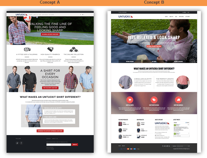
Most often, the website will end up being a combination of the two. At first, there is a clear winner that the client is leaning towards but with elements of the other design. After the meeting, the project manager sends the designs to the client to digest further and gather consolidated feedback over the next couple of days. At this stage, the type of feedback we are looking for is broader and covers items like:
- Colors
- Fonts
- Imagery
- Use of company branding
- Ease of navigation
- Hierarchy of messaging/elements on the page
The goal of the client’s feedback after this round is to pick a single design direction to establish the look and feel for the rest of the site.
Template Design and Page Layouts
Once you agree on the home page design direction, the next step is to design an example for each of the unique templates that will be built for the new website.
A common question that I get is “What is the difference between a page template and a page layout?”
A template is the bones of your page regardless of the content on the page. It breaks things down into zones.
For example, you might have a 2 column page template that has a banner across the top, a left sidebar column (1/3rd width) for navigation and then a main editable HTML area on the right (2/3rd width).
Using this template, you could have multiple page layouts. You may use this for a contact page where you place a form into the right column, or alternatively it might be used for a text page.
A best practice is to have the designer layout an example for one of each page template that your site will use, as well as unique examples of a page layout so that the client can visualize what the pages will look like.
In addition to laying out these unique pages, a style guide should also be created so that there is consistency across the site for elements like font size/color, buttons, icons, link style, navigation (active/hover states), and styles for miscellaneous items like bullets, tables, forms, etc.
Edit cycles vary by project but typically 2 edit cycles is normal for a design project.
Responsive Design
Almost all new websites are built with tablet and mobile-friendliness as a requirement. If responsive design is part of your project, these layouts will be completed last, based on the approved direction of the desktop designs.
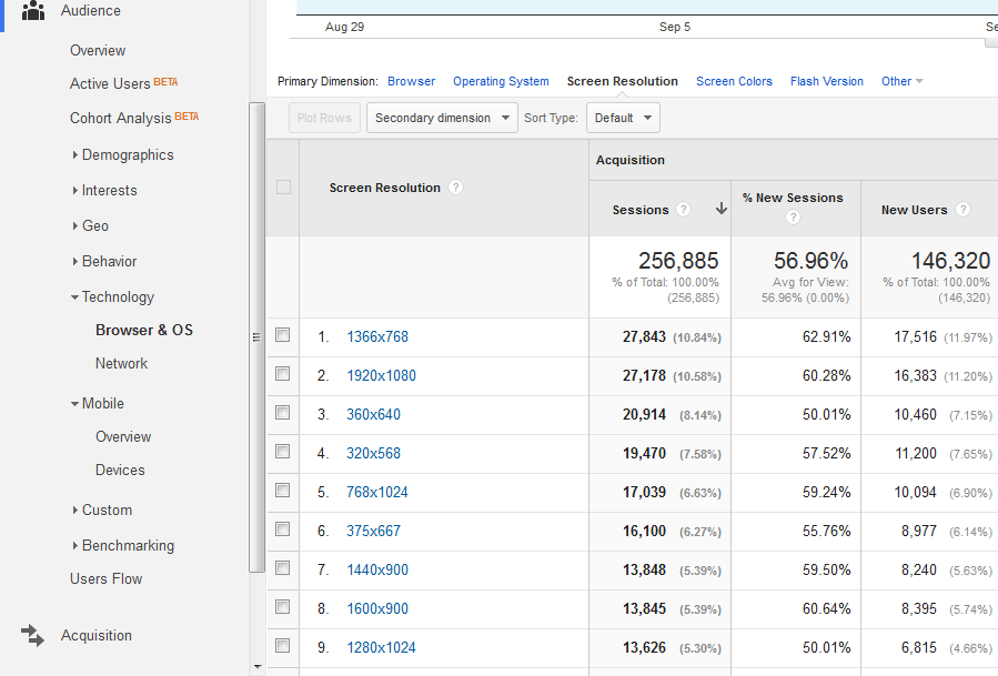
Typically, the tablet breakpoint is 768px wide and mobile is 320px or 480px. The best way to determine what breakpoints you should focus on is by looking at your Google Analytics and going to Audience → Technology → Browser and OS and then click on Resolution.
You can now see the screen resolution that your site is viewed on most often.
Once the desktop versions of each page are approved, the designer will layout an alternative version of each for tablet and mobile so that content is still easy to view and navigate through. These will also be provided for client review and approval.
Once all designs are finalized, the client approves them as the final versions that will be developed. In the next post, we’ll cover the process for bringing these designs to life/the build-out of the website: Production and Quality Assurance.
Thinking about redesigning your website?
Contact us today to find out how we can help you!
Related Articles

Elevating Your Brand: The Transformative Power of Website Design
In the digital age, your website is often the first point of contact between your brand and potential customers. It's not just a platform to showcase [...]
Navigating the Digital Landscape: Website Design Trends of 2024
In the ever-evolving realm of digital innovation, website design trends serve as the compass guiding businesses and creators toward impactful online [...]
A website upgrade can drive success in transportation
When people think of long-haul trucking, heavy shipping, or other sectors of the transportation industry, “cutting-edge online experience” may not be [...]