Posted on 8/20/2019 in UX and Design
When was the last time you did some banking online? Or did you recently search for a new credit union? There are so many banks and credit unions to choose from, but how many banking websites have a good user experience, are engaging and actually compel you to go beyond the home page? Designing websites for the banking industry is not an easy task. This begs the question: what makes a banking website a “good” one? There’s a lot of competition out there and it is not easy to stand out amongst the masses. I took some time to look at a few and am showcasing a few of my favorites and what makes them a step ahead of the others. Here are a few that made my list of best bank websites:
Ally - https://www.ally.com/
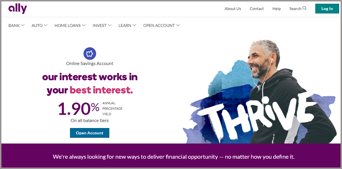
A somewhat newer concept is an online bank that is, well, only online! Ally has no brick and mortar locations. They offer a full suite of services from traditional banking to home loans, auto financing and investment services. In today’s world where everything is virtual, why not your bank?
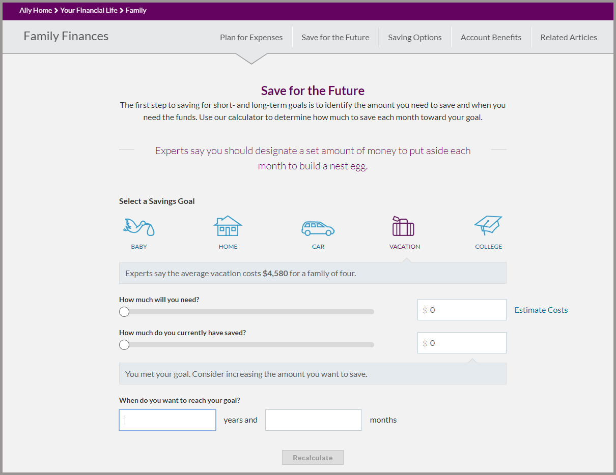
Ally’s website is crisp and clean, offering several tools for consumer use, many right on the home page. One of my favorites is the Save for the Future. You can select a savings goal, like having a baby (Experts say parents spend an average of $12,000 the first year of a child's life!) or saving for vacation (Experts say the average vacation costs $4,580 for a family of four!). There are several short questions that you answer in slider form or input of numbers. And it auto-generates a monthly savings goal to meet by the date you have selected. Of course, you can play with the sliders and instantly generate different monthly payment amounts. This makes planning for a goal one step easier.
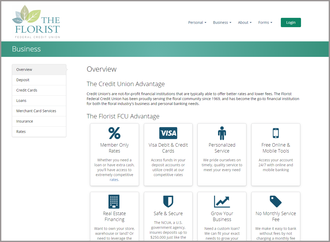
The Florist Federal Credit Union - https://www.thefloristfcu.org/
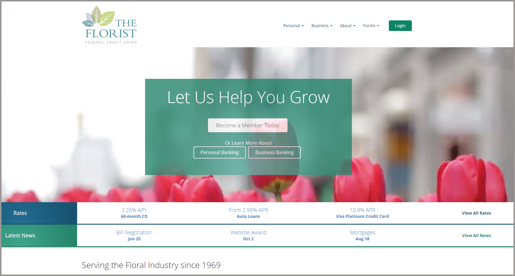
In case you were wondering, this credit union is specifically for the floral industry. This credit union's site is not only easy on the eyes with its simple design, but also its messaging is clear and concise. The home page offers information that most users are looking for: rate information, uncluttered navigation and an obvious call-to-action for signing up to become a member. The interior pages mimic the simple look and feel of the home page and are easy to navigate.
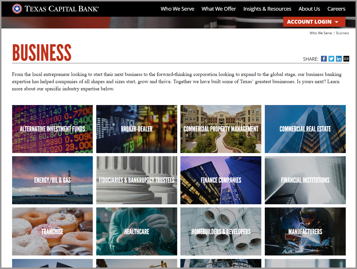
Texas Capital Bank - https://www.texascapitalbank.com/
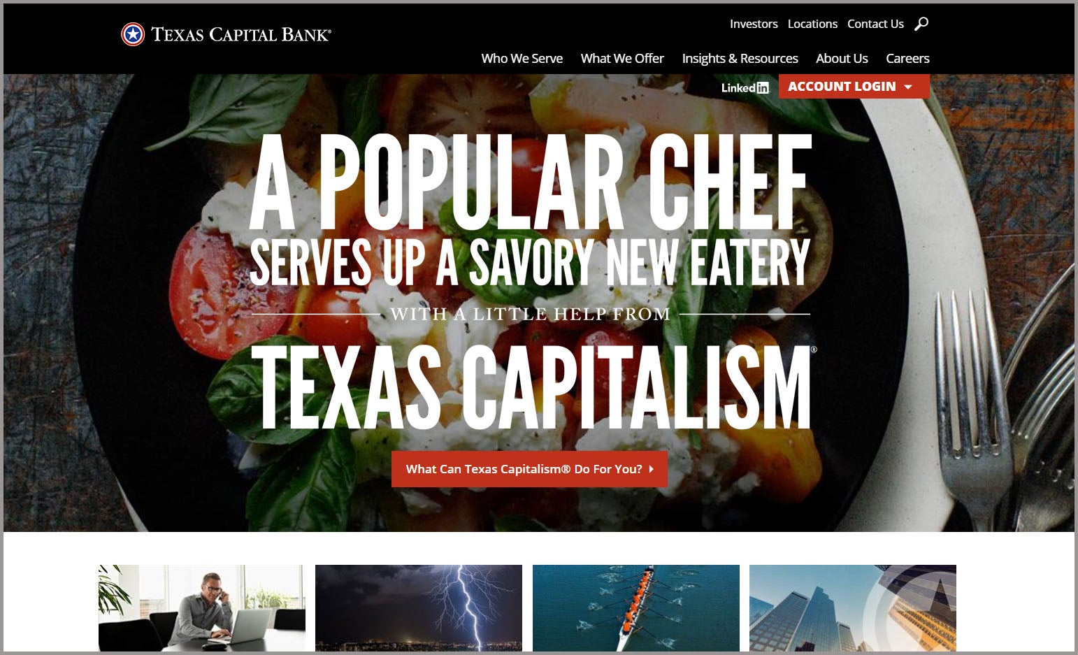
Talk about personality! This banking website has it. There is no mistaking that Texas Capital Bank is firmly rooted in Texas and serves its user's specific needs. The imagery is strong and with clear concise messaging. It's easy to see their content is personalized and resonates with their target audience. They have a landing page that lists 20 categories of businesses they have helped to grow broken down by industry. This page is simply laid out and helps the visitor find the area of expertise they are looking for.
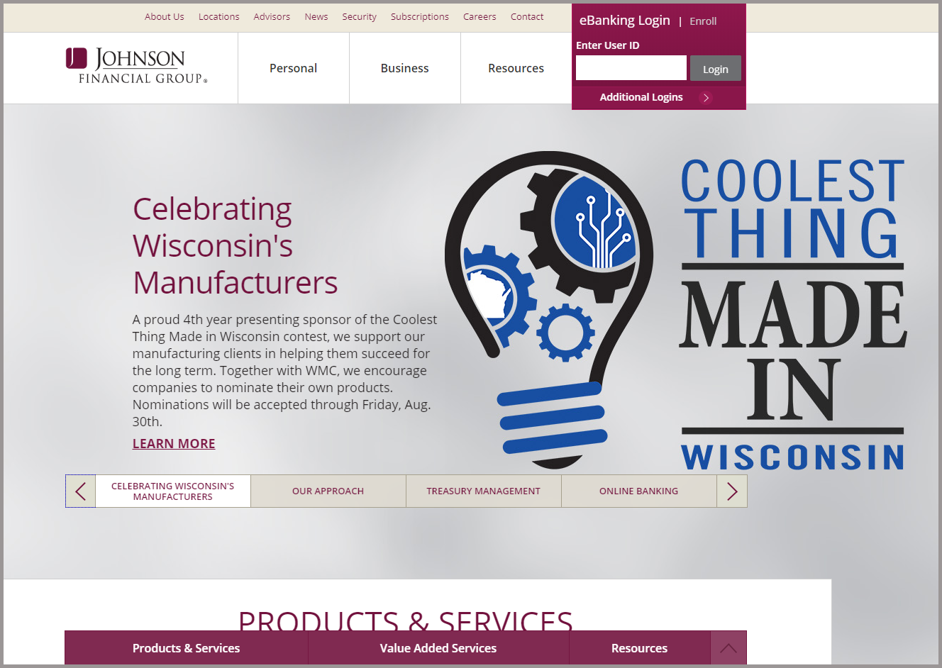
Johnson Financial Group - https://www.johnsonbank.com/
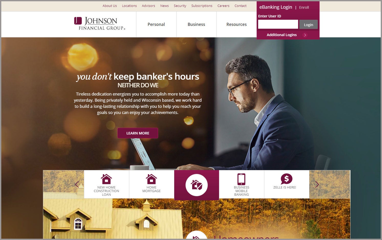
Johnson Financial Group has a striking color scheme that is sophisticated and catches a visitor’s attention. They have parallax scrolling that is visually pleasing and enables users to easily navigate with a smooth user experience. Their navigation is clean with clear call-to-actions that quickly lead a visitor to the information they are looking for. Based in Wisconsin, they are proud of their manufacturing clients and encourage them to participate in the “Coolest Thing Made In Wisconsin.” This connects them with local businesses and shows commitment to helping in their community.
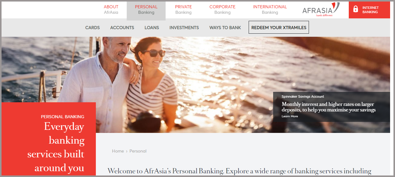
AfrAsia - https://www.afrasiabank.com/en
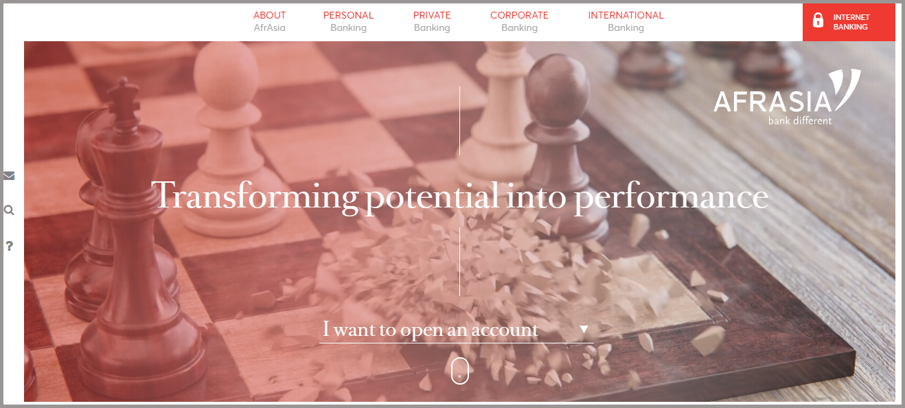
Talk about edgy design? This banking website is a feast for the eyes. AfrAsia’s tagline is “Bank Different” and they have embraced this fully and it shows. Their homepage is mesmerizing and leaves the user wanting to explore more to discover their offerings. Their use of crisp and striking imagery is beautiful, definitely projecting a refined and global presence. The feel of the site is sophisticated and sleek and easy to navigate. AfrAsia knows their target audience and serves up messaging that is on point. They want the user to know that their services are tailored and they want to build a personal relationship with every customer.
As you can see from my top picks above, the best banking websites have many personalities and can appeal to very specific audiences. Your financial institution can show its strengths in many ways. If you want to learn more about designing or redesigning an effective site that represents your brand, Wakefly can help. Reach out today and see how we can help you successfully engage online.
Looking for help on how you can make your banking website more customer focused?
Contact Wakefly for a Free Consultation
Related Articles

How Do I Optimize My Website for AI?
Why do you need to optimize your website for AI?AI-powered search engines like Google’s AI Overview, Perplexity, and tools such as Microsoft's [...]

Outdated or Outstanding? How to Tell If Your Website Needs a Refresh
Your website is the digital face of your business. It serves as a first impression, a marketing tool, and a resource for potential customers. [...]
Preparing a Website Redesign Budget for 2025: A Step-by-Step Guide
As we approach 2025, businesses are recognizing the necessity of a fresh, user-friendly website to stay competitive in a rapidly evolving digital [...]