Posted on 3/10/2016 in UX and Design
One of the most important features of any website is clear, easy to use navigation. Every year there are new design fads that clients have heard about and want to incorporate into their site. However, trying too hard to be trendy can cost you in other areas like user-friendliness and search rankings. Below I have reviewed some of the most common web design and navigation trends in 2016 and what to look out for:
The Hamburger Menu
This is most commonly used on mobile versions of sites but there has also been a trend to bury most of a site’s navigation in a hamburger menu only on desktop.
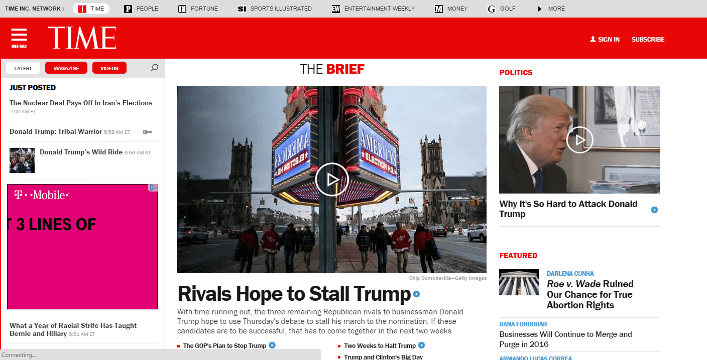
This keeps the header area of the site very clean and open. For a site like Time, an approach like this can work because they really want to drive you to subscribe (or sign in if you are already a subscriber). The news topics that will drive you to the articles are hidden in the hamburger menu that you must click to expand. Once you start exploring the articles on the site for free, it’s probably less likely that you are going to be focused on the “subscribe” at the top.
While this model works for Time, for the average site, you don’t want to make users dig to reach your content. You want to utilize standard main navigation in the header area of the site with no more than seven main menu items. These should be logically named and grouped based on what your audience is typically searching for when they come to your site.
For mobile, navigation options are more limited so the hamburger-style button is almost unavoidable. That said, if room allows, add links or buttons to your most important areas of the site (ex: shopping cart for an e-commerce site).
Home Page Carousels
This isn’t the first blog post that I’ve written about avoiding home page carousels, yet it remains a popular website trend. If you are putting key messages and calls to action in a home page carousel, they are likely getting lost; especially content on anything beyond the first panel. No one is navigating to your home page and just sitting there waiting for the carousel to scroll through fully. You cannot rely on the links in the carousel to guide people to key content on your site.
There are other downsides to carousels like accessibility issues, performance/load time and they’re not great for SEO. Even though many people will start on your home page when viewing your website, they aren’t going to stay there. Use calls to action and navigational elements on your home page wisely to draw your users further into your site.
Complex Load Screens/Too Many Calls to Action
Another common design/navigation issue is simply trying to do way too much at the same time. A website can suffer from too much design. When a page loads, it can be slowed down by things like:
- Too much javascript
- Parallax effects
- Too many images/images not optimized for web
All of the above can really weigh down a web page. When you land on a web page, all of these elements need to load so when you have a lot of heavy files, the site speed really suffers. If you are curious about your own site’s load time, Pingdom is a great resource to use.
Beyond the speed issues, if you have too many elements on your home page, it’s really hard for users to focus and know where to go next. This goes back to the same problem as carousels, you want your users to be able to navigate off the homepage and drill further into the content of your site.
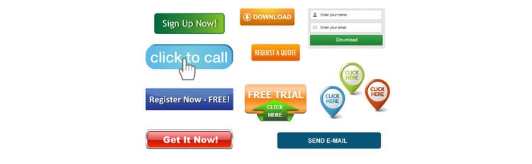
Really try to limit the calls to action on your page. If you really want people to subscribe to your newsletter, make sure you have a button featured prominently that drives people to do just that. If you bury it alongside a bunch of other buttons, you really confuse your message and your user.
Less is More
Don’t be a victim of design fads. At the end of the day, if a website doesn’t function well, no one will care how pretty it looks. If a site is too slow, difficult to navigate, or just plain confusing – users will abandon it.
Looking for help with your next website redesign? We would love to help!
Struggling to get more visitors to your site?
Request your free site audit today!
Related Articles

Elevating Your Brand: The Transformative Power of Website Design
In the digital age, your website is often the first point of contact between your brand and potential customers. It's not just a platform to showcase [...]

Navigating the Digital Landscape: Website Design Trends of 2024
In the ever-evolving realm of digital innovation, website design trends serve as the compass guiding businesses and creators toward impactful online [...]
A website upgrade can drive success in transportation
When people think of long-haul trucking, heavy shipping, or other sectors of the transportation industry, “cutting-edge online experience” may not be [...]